BUSINESS & TECHNOLOGY

E3 Financial Planning


Brand Refresh

Website Design

Website Development

Photography Art Direction

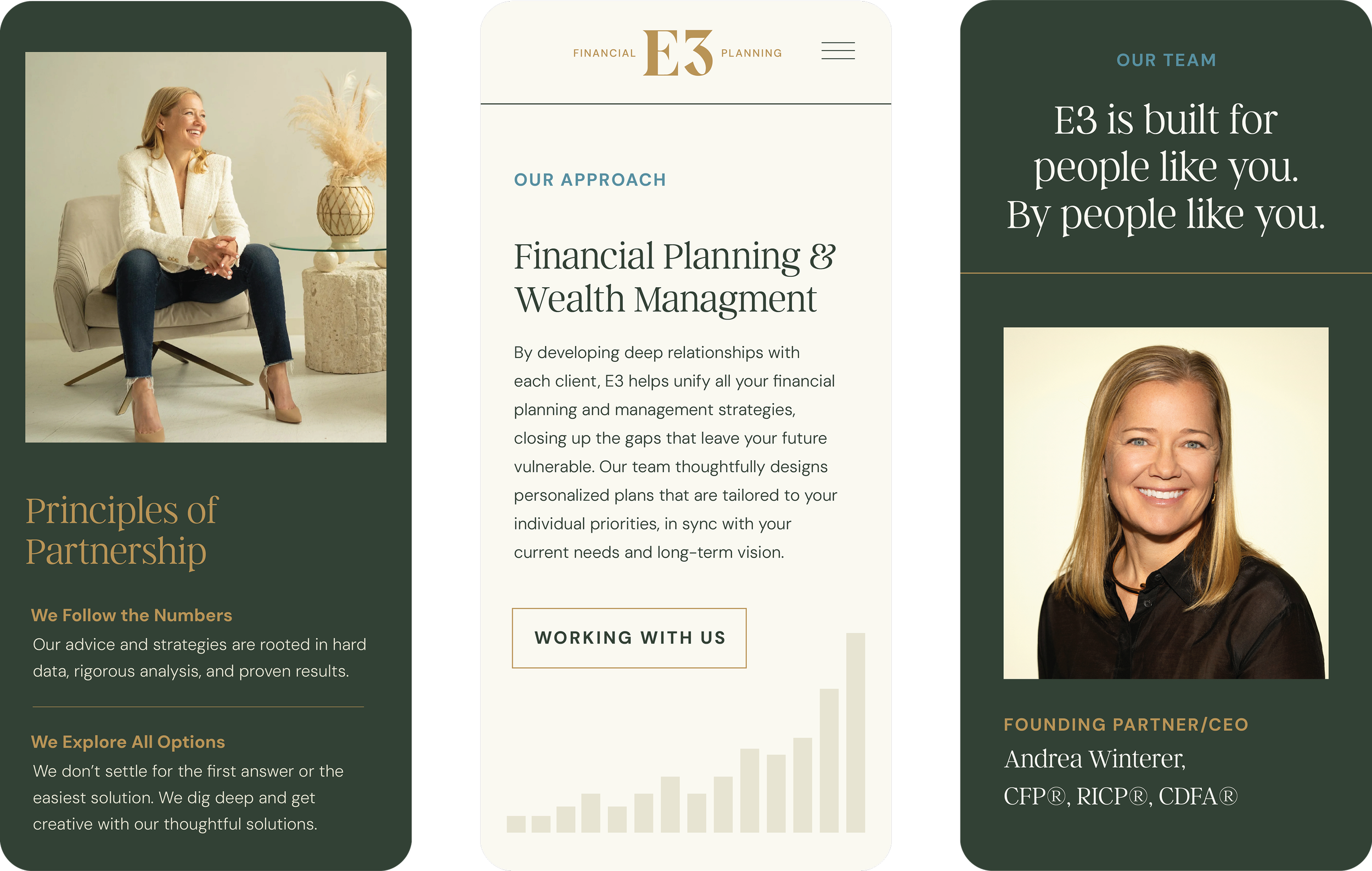
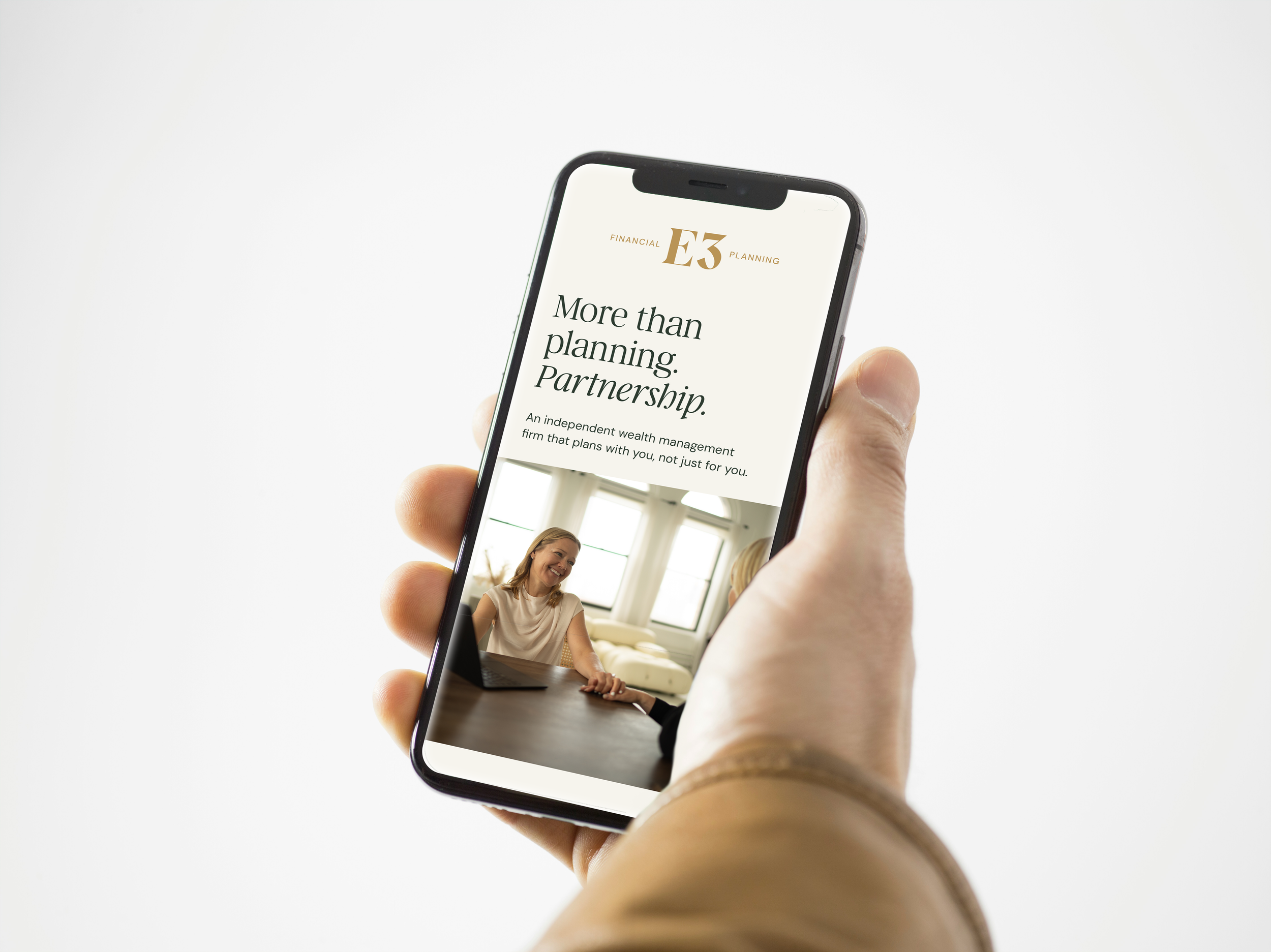
Financial planning made simple.

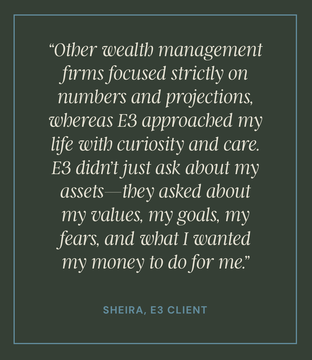
Financial planning sends many of us reeling, but it doesn’t have to. Unlike many wealth management firms, Newton-based E3 simplifies the process so that people in all life stages feel empowered (not overwhelmed) by their finances. We created a brand identity and updated website that reflect E3’s accessible approach while appealing to women, its niche audience.

Logo with large gold letters E and 3 on dark green background, with smaller text reading 'Financial Planning' on either side of the logo.

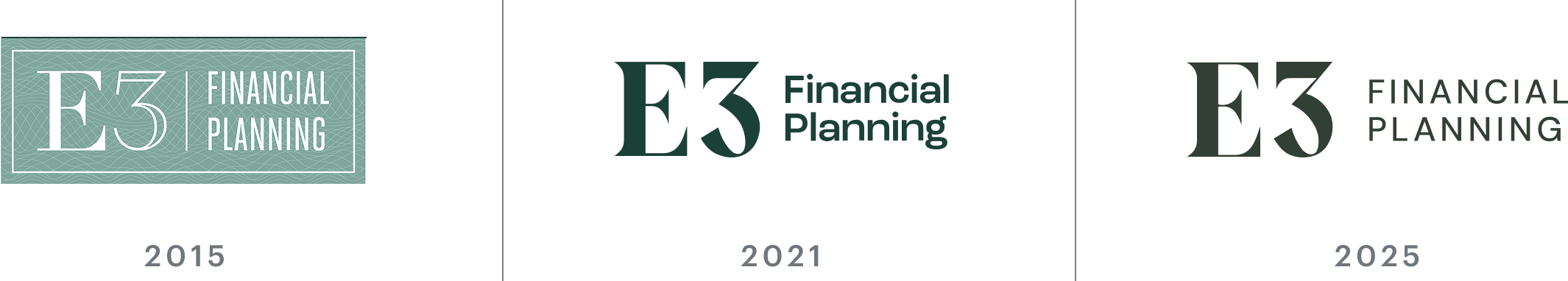
We have partnered with the E3 Financial Planning team for over 10 years, beginning with the design of their logo in 2015. Since then, we have continued to refine and refresh their brand to align with the firm’s growth and ideal clientele.

Timeline showing the evolution of the E3 Financial Planning logo from 2015 to 2025. The 2015 logo features a teal background with white text, the 2021 logo has a dark green font, and the 2025 logo uses the same dark green font with a different layout.
A website layout for a financial planning company named E3. The layout features a woman in a white blazer and jeans sitting on an armchair, smiling, with a table and ornamental dried plant beside her. The website contains sections with information about their approach, principles, team, and founder, Andrea Winterer, with photos and text in a modern, clean design using dark green, beige, and light blue colors.
Quote about personal values and goals by Sheira, an E3 client, on a dark green background with a thin blue border.
A person holding a smartphone displaying a website for financial planning, with a woman smiling and talking in a well-lit room.