NON-PROFIT & EDUCATION

The Carroll School


Brand Refresh

Messaging

Infographics

Illustration

Print Collateral

Belonging is more than a place.

The Carroll School is an independent day school dedicated to empowering children with language-based learning challenges like dyslexia. Their marketing team was in search of an evolution of their brand that better represents their spirit and the latest campaign of “belonging.”

A school magazine titled "Connection" with a smiling boy holding a craft stick with a smiley face on it, on a wooden surface.
Abstract geometric design with a star shape, blue background, and pink accents.

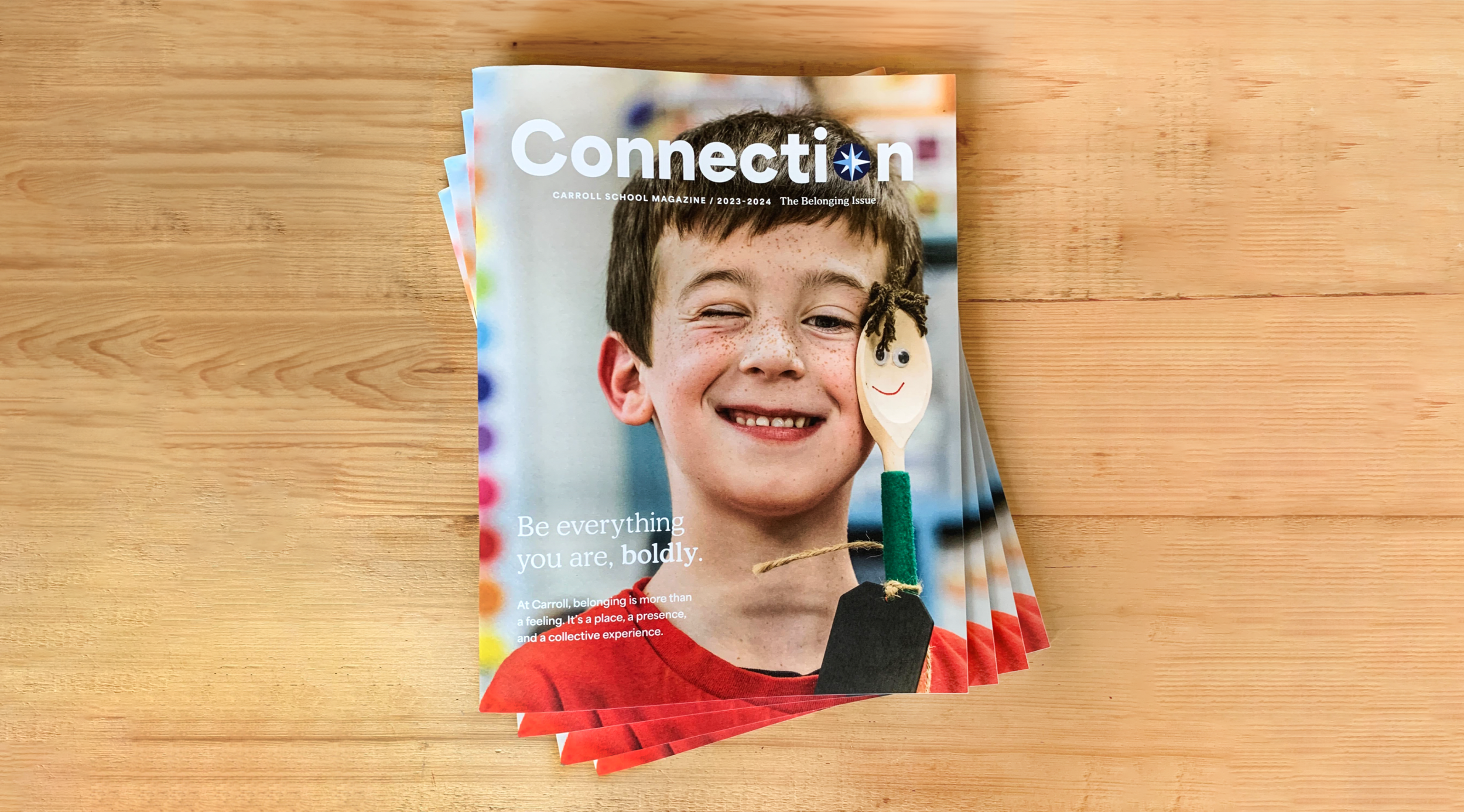
Each student at Carroll is valued and celebrated as an individual learner and for who they are as people. Throughout the campaign, magazine, and direct mail pieces, a vibrant palette of star shapes represent that individualism. The stars layer and interact to create a sense of community and acceptance.


This belonging theme was carried throughout the reimagined magazine design incorporating custom illustrations and infographics. 

Multiple open magazines showing colorful pages with articles, images, and graphics related to education, alumni, data, and learning themes.
Open magazine spread showcasing photos of students and families with quotes about belonging at Carroll School. The layout includes large, bold headings and colorful images.
A young person with curly black hair and a gray hoodie writing in a notebook with another young person with brown hair in a red shirt sitting nearby during daytime outdoors.
Collection of five colorful graphic star and geometric shapes in yellow, purple, blue, and green.
Brochure or flyer promoting Carroll School highlighting its educational approach, student success, and donation options with images of diverse students engaged in activities.